Website & Branding Design Portfolio
I work together with small businesses, freelancers and service based entrepreneurs designing creative brand identities along with modern, fresh and stylish WordPress websites.
Erin Adams Design
Client Type: Home decor & tile design
The Project:
- Brand Identity
- Print design
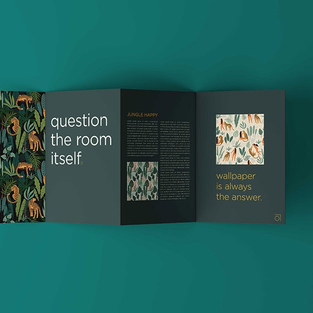
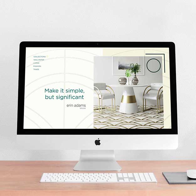
The Brief: The primary goal was to redesign the website, but first, we needed to create a design system to be used across digital and print media. The project included redesigning the logo and creating a supporting brand strategy.
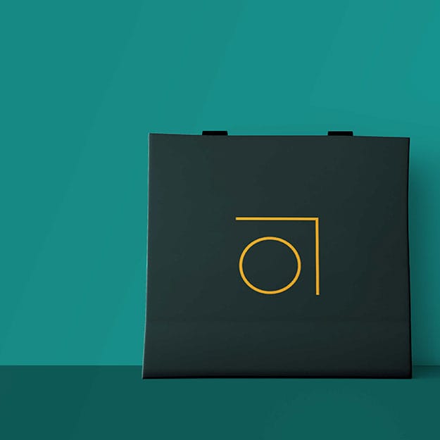
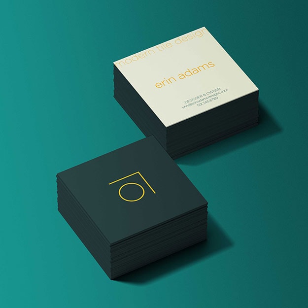
Design Notes: The accent color of yellow-orange with its vibrant appearance can uplift, inspire boldness, and promote feelings of happiness. Dark greens are the most stable and representative of affluence while also being associated with freshness and renewal. The logo mark symbolizes both the lower case “a” deconstructed to its basic shape and an abstract tile.
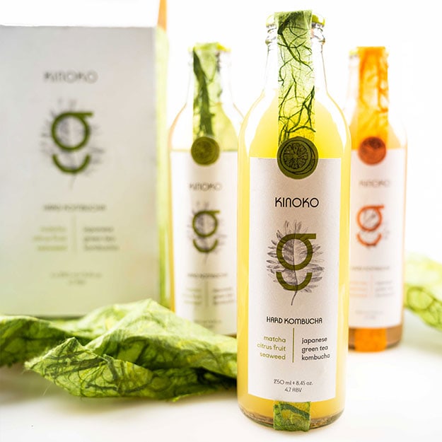
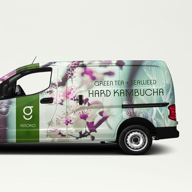
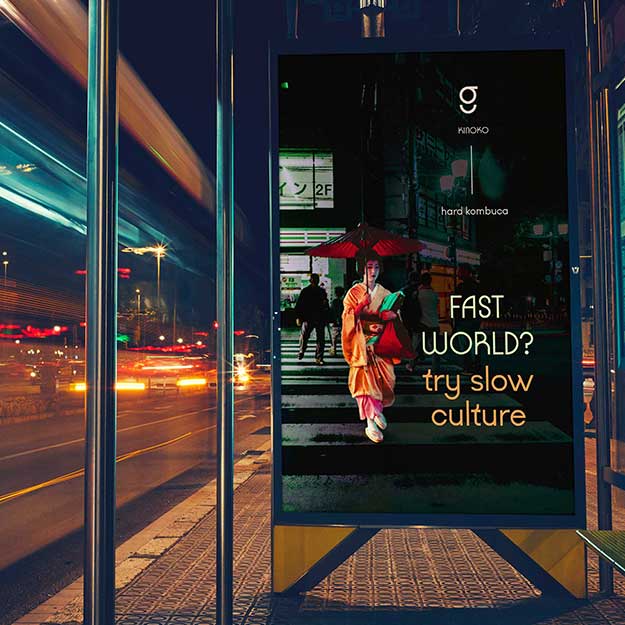
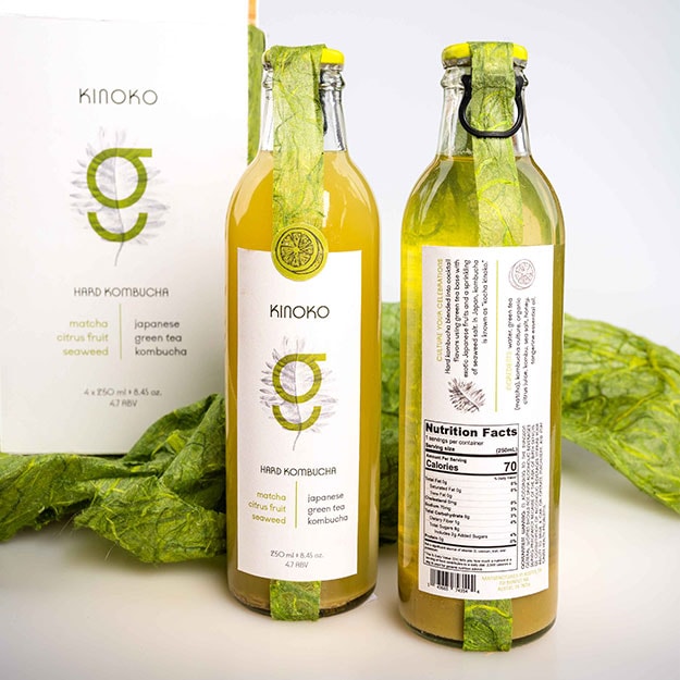
Kinoko Kombucha
Client Type: Fermented Green Tea Drink
The Project:
- Brand Identity
- Packaging
The Brief: The handcrafted look and feel of the packaging help differentiate from the competitors of this new to market product and increase sales.
Design Notes: The type chosen was Kobe, which includes rational shapes of Japanese letterforms. Its identity of Kinoko is expressed in various details with the handmade seaweed paper and unusual forms of Japanese gift wrapping styles reimaged into a box to hold the bottles. The colors are soft and use green as the primary color to symbolize the premium green tea and Japanese citrus fruit orange.
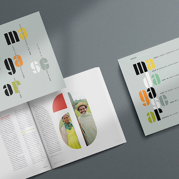
Sourced Magazine
Client Type: Print Magazine
The Project:
- Photography
- Layout Print Design
The Brief:
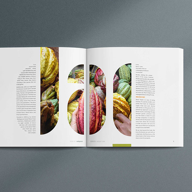
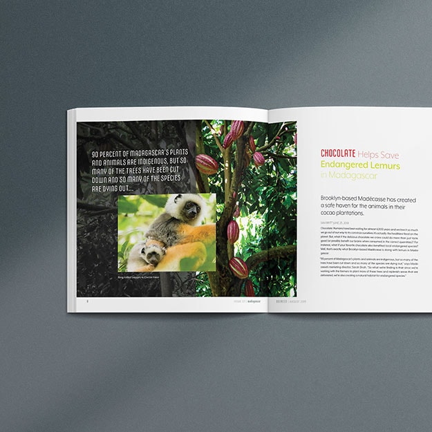
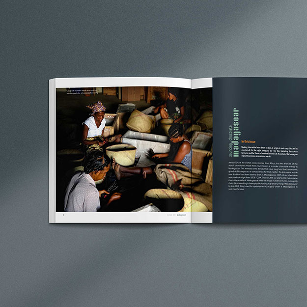
Design a magazine that shares a rich visual story with colorful photography and vibrant stories told by first-hand accounts of the producers.
Design Notes:
The magazine cover has simple letterforms splayed out with article titles spliced between the letters. Which will be a reoccurring theme with different countries’ names spelled out as each issue move to cover products from around the world. The cover was kept clean with soft grey color and vibrant colored letters that carried the same color palette as the inside photography. The stenciled letters also have a craft feel to them, just like the magazine subject’s handcrafted aspect. The insides have Madagascar spelled out in large letters filled with photos and text in-between each article.
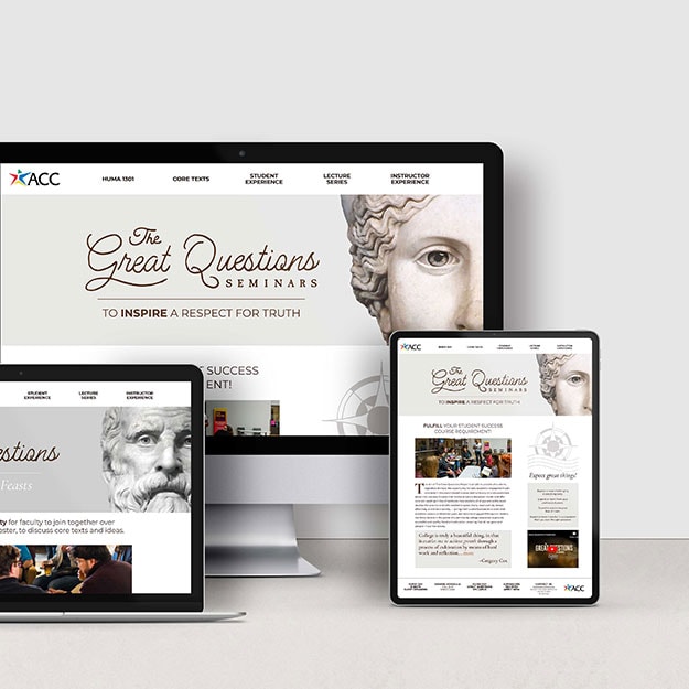
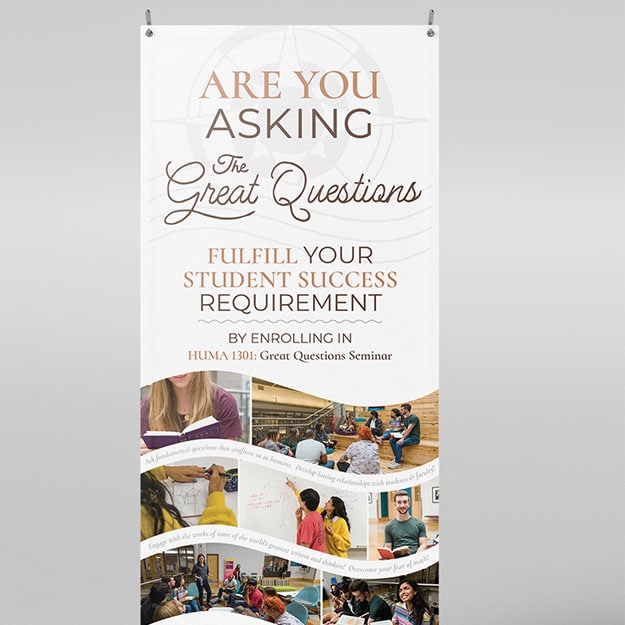
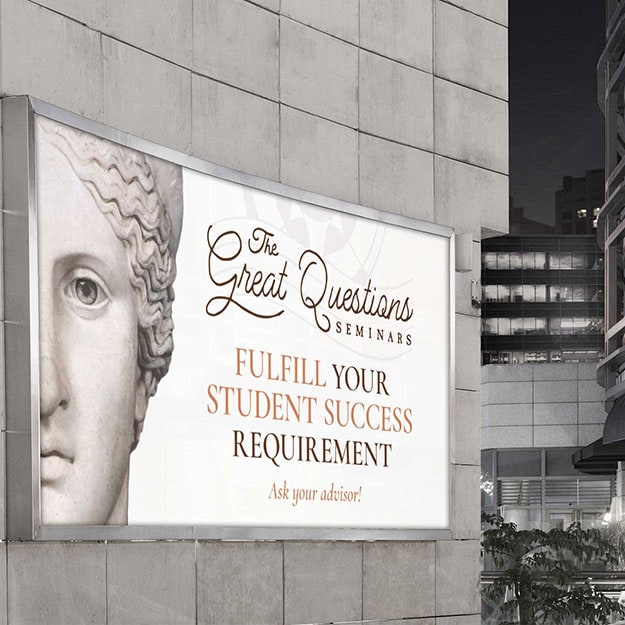
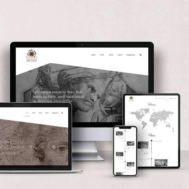
The Great Questions Seminars at ACC
Client Type: Non-Profit / Education
The Project:
- Branding Identity
- Website Design
The Brief: The primary goal was to redesign the website for the program to accomplish the following objectives:
- Inform ACC students that they may fulfill their course requirement with this course as a substitution and increase registration rates.
- Recruit faculty to teach classes and create interdisciplinary faculty collaboration.
- Create a second timeline website to support with online teaching
Design Notes:The project colors reflect the soft tones of classic sculptures and provide warmth, reflection, and light.
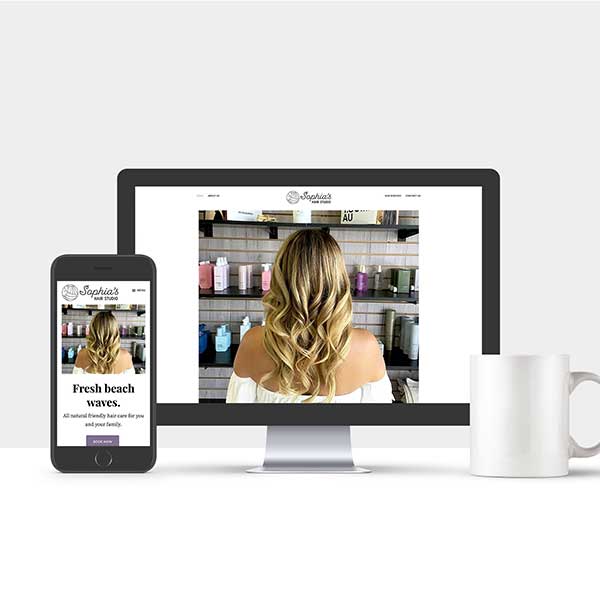
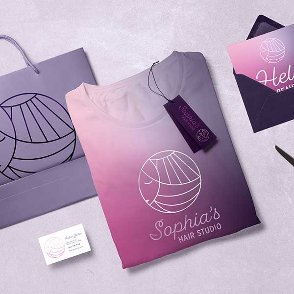
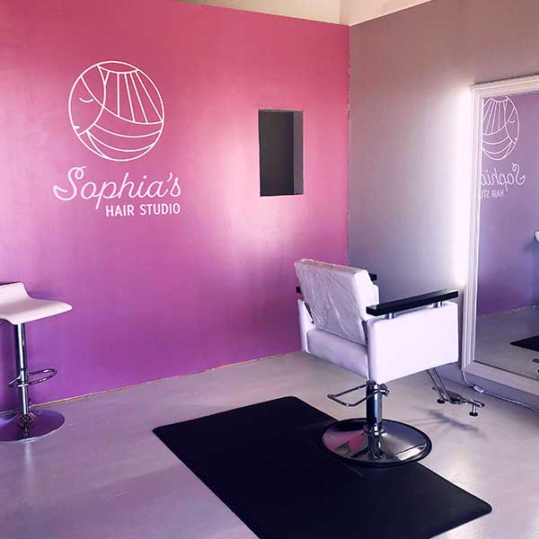
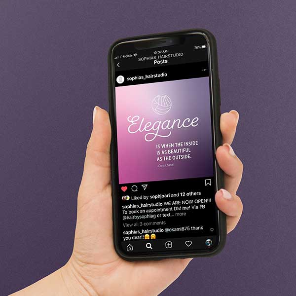
Sophia's Hair Studio
Client Type: Hair Salon
The Project:
- Brand Identity
- Website Design
The Brief: Create a fun, feminine beach brand identity for a hair studio located on an island.
Design Notes: Building a unique brand for the beach-loving clients while bringing in the salon’s bright and feminine personality.
Watson Paper Design
Client Type: Home decor & tile designer
The Project:
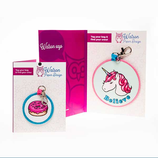
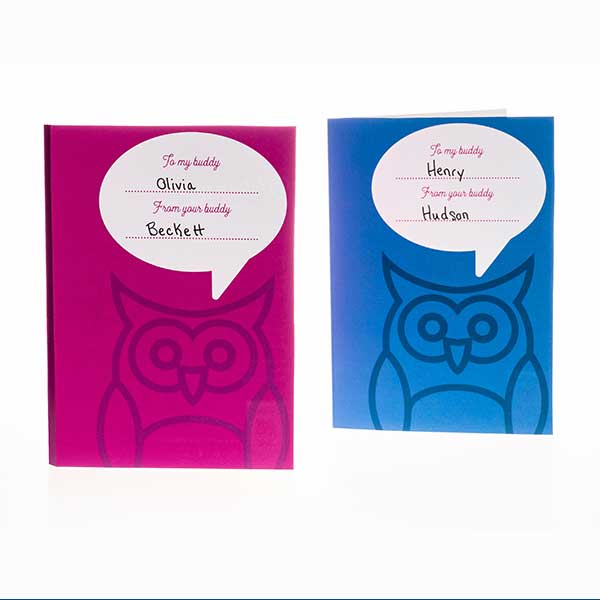
- Packaging
- E-commerce Website Design & Build
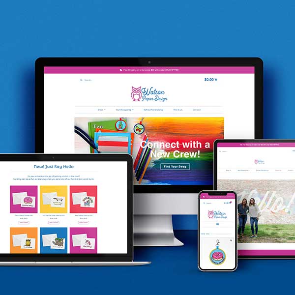
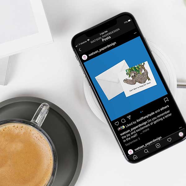
The Brief:Watson BagSwag designs kid-friendly social products that give kids a new non-digital way to make friends. Moms will engage with WBP on the brand level. The website should speak to the ways the product will build a better life for her kid. The look should be modern and fresh to appeal to her visually as well.
Design Notes: Color is a huge component of this brand! We used a bright, bold, and modern palette in the website design, which speaks to adults and children alike.
Websites Created
